
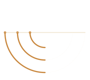
The CAVEA Mark
BRAND STORY
The CAVEA mark draws from two powerful sources: the cavea — the tiered seating of a Roman amphitheatre — and the concentric rings of a film lens aperture.
Three graduated arcs represent the tiers of the ancient cavea, symbolizing our connection to Turkey's rich cinematic and cultural heritage. They also echo the aperture blades of a camera lens, reflecting our core craft of visual storytelling.
A horizontal baseline anchors the composition, suggesting both a film strip and the horizon line that connects East and West — just as Istanbul bridges two continents.
Obsidian #090909
Primary background — near-black with warmth. The deepest tone in our palette, setting the cinematic mood.
Night #0D1220
Secondary surface — deep navy-black for cards, panels, and elevated surfaces.
Navy #1A2540
Border and input color — subtle separation between elements without harsh contrast.
Amber #C8863C
Primary accent — warm gold inspired by Istanbul sunset light. Used for CTAs, links, and emphasis.
Cream #F2E8D5
Foreground text — warm off-white for readability against dark backgrounds.
Dust #BFB49A
Muted foreground — warm gray for secondary text, captions, and subtle labels.
Cormorant Garamond
Headings — A refined, high-contrast serif inspired by Claude Garamond. Light weight (300) for elegant, large-scale display type.
Syne
Navigation & UI — A geometric, modern sans-serif designed for creative industries. Used for navigation, buttons, labels, and small-caps treatments.
Crimson Pro
Body text — A contemporary serif optimized for screen readability. Light weight for long-form content with generous line-height (1.7).
Press Materials
Download & Explore
Access our complete brand identity system and interactive logo showcase:
- Brand Identity Guide — Complete brand system with color palette, typography, logo variants, moodboard, and stationery mockups
- Interactive Animated Logo — SVG animation with multiple variants and color theme switcher
- Logo Mark (SVG) — Vector logo mark for print and digital use
Usage Guidelines
When using the CAVEA FILM brand assets, please maintain clear space around the logo equal to the height of the mark. The amber (#C8863C) should remain the primary accent color. Do not distort, rotate, or apply effects to the mark. For co-branding inquiries, contact semih@caveafilm.com.